Atkinson Hyperlegible Font
(brailleinstitute.org)765 points by fanf2 4 days ago | 221 comments
765 points by fanf2 4 days ago | 221 comments
jay_kyburz 2 days ago | root | parent |
You know, this feature could be a little side bar on the top right, or just as a header for every post. (I assume its semi automated, but I would be happy to see it all the time)
rolfus a day ago | root | parent | next |
Agreed. The 3rd party app I'm using to read HN on mobile (Glider) has this feature and it's both useful and unobtrusive.
Screenshot: https://www.imgpaste.net/image/SDoBg6
yesco a day ago | root | parent | prev | next |
Isn't that the point of the "past" button though? I've always assumed the purpose of Dang's "related" comments were to help bridge the discussion.
deepfriedbits a day ago | root | parent |
It seems as if the past button allows you to view a snapshot of the site on a given day, whereas Dang's bundles are previous instances of the topic/link being discussed on HN.
shepherdjerred a day ago | root | parent |
There is also a past button for submissions
xanth a day ago | root | parent | next |
Thanks for sharing! I'd never thought to click through and see
oneeyedpigeon a day ago | root | parent |
Me either! Maybe if dang included a "past" link in the comment, more of us would learn about it.
deepfriedbits a day ago | root | parent | prev |
Oh wow, thanks!
BerislavLopac a day ago | root | parent | prev | next |
The "Refined Hacker News" extension for Chrome [0] and Firefox [1] adds something similar (among other things) to the bottom of every thread.
[0] https://chromewebstore.google.com/detail/refined-hacker-news...
[1] https://addons.mozilla.org/en-US/firefox/addon/refined-hacke...
NKosmatos a day ago | root | parent | prev | next |
Before I post something on HN I always do a search to see if it has been posted recently. If it's more than 2-3 years old, I post it again in order for new users (and others who forget it) to notice it.
There have been other similar suggestions i.e. when filling the information for a new submission to have an automatic duplicate search and produce a warning, but I've come to understand that adding features to the simple/lean HN page is not desired. Same goes for native dark mode (with having to load scripts/plugins/whatever).
I can understand Feature Creep (https://en.wikipedia.org/wiki/Feature_creep) fears, but it seems that here we're doing the exact opposite :-)
Terr_ 17 hours ago | root | parent | prev | next |
I wonder if making old comments too-easily available backfire by reducing new takes and fresh discussion. Probably not in this particular case, it seems like a potential risk when designing a social news site.
P.S.: I choose to believe the neurons that instinctively throw up "but what if it's actually bad" represents a useful software design skill, rather than just a personality flaw. :p
al_borland a day ago | root | parent | prev |
Clicking the URL next to the post title provides this, at least for fairly unique pages. It’s less useful when the link is from a popular news site.
omoikane 2 days ago | prev | next |
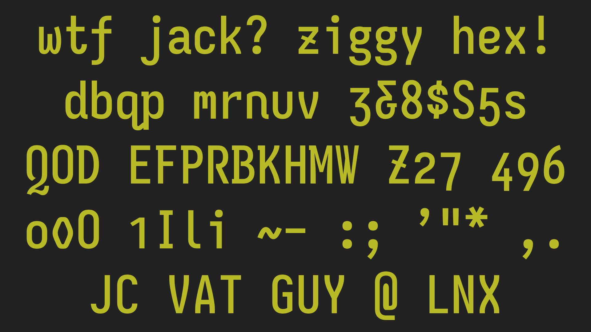
Atkinson Hyperlegible appears to slash their zeroes in the same direction as backslash, unlike all other fonts I have used where the slash in slashed zeroes have the same direction as a forward slash. Not sure if this was a deliberate design choice.
https://fonts.google.com/specimen/Atkinson+Hyperlegible?prev...
https://fonts.google.com/specimen/Inconsolata?preview.text=0...
zinekeller 2 days ago | root | parent | next |
Probably since that it's intended for legibilty, it's to differentiate 0 from Ø.
fsckboy a day ago | root | parent | next |
>it's to differentiate 0 from Ø [a letter used in Danish, Norwegian]
most importantly it's to differentiate it from ∅, mathematical null set.
"computer people" feel this understandable need to differentiate their zeroes, but "CS-is-math people" are like "but don't use null set!" <— ᵇᵘᵗ ʸᵒᵘ ʲᵘˢᵗ ᵘˢᵉᵈ ᶠᵃᶜᵗᵒʳᶦᵃˡ
snatchpiesinger a day ago | root | parent | next |
I use DejaVu Sans Mono for programming, it places a dot inside 0.
fsckboy 9 hours ago | root | parent | next |
I just tested it (have tested it before, always looking for mono fonts)
DejaVu Sans Mono does not look anywhere near as good as Lucida Sans which is LibreOffice Calc's default for me, comparing just the numerals. The digits in this variable pitch font are fixed pitch so it's suitable for spreadsheets.
(I mentioned the extra marking on zeros in the spirit of the thread, but personally I don't care about it, I'm not mixing up letters and digits much irl or especially in a spreadsheet.)
but in any case, the DejaVu Sans Mono glyphs rise up above the baseline, floating in the cells, and they are larger for a given pointsize. I don't know whose fault this is, but my complaint is that every time I try to look at different fonts, the futz-around-and-find-out factor is so great it's just a waste of time. It's a problem across systems (windows, linux, mac), across generations (Motif, 3.1) it's a problem across apps, it's just a problem that's completely unnecessary. I think font people spend too much time looking at their font on a tabula rasa wedding invite, and not enough time doing comparative font selection in ordinary apps.
tempodox 19 hours ago | root | parent | prev | next |
If you like DejaVu, you'll love BitstromWera Nerd Font [1] (looks almost the same, with some improvements). It works great with Starship [2].
saaaaaam 15 hours ago | root | parent | prev |
Possibly idiotic question: I'm fairly new to actually writing code myself in any thing more than a tinkering way. What do you use for programming where you can choose the typeface?
nyantaro1 15 hours ago | root | parent |
You mean a text editor where you can change your font? I am pretty sure most of them support that feature, VS Code just to mention one. Or do you mean other kind of tool?
IshKebab a day ago | root | parent | prev | next |
Hmm I think there are probably more Danish and Norwegian people than mathematicians writing about null sets.
zinekeller 20 hours ago | root | parent | next |
You're (probably) correct, considering that the specimen used Ø instead of ∅ (see https://braileinstitute.app.box.com/s/gw2s8k5kfc6t1uabkiyqlc...), and the font do not have the null symbol.
(also like the German commenter the null set is an empty set = {}, I only encountered ⌀ as diameter symbol, actually)
bmicraft 10 hours ago | root | parent |
Wow, what ever that website is doing manages to completely and utterly break my gpu rendering in a way I haven't seen a site do in over a decade. It just paints the text over whatever was there last, including other windows above my browser.
cue_the_strings a day ago | root | parent | prev |
No way, DK and NO aren't that big, and you learn about empty sets in HS in most of the world. I'd wager there are currently more Indian high schoolers than people in DK/NO.
jansan a day ago | root | parent | prev |
Is the exclamation mark character for factorial different from ASCII x21?
ndsipa_pomu a day ago | root | parent |
No!
a_e_k a day ago | root | parent | prev |
I used a reverse-slashed zero in my programming font [1][2] for exactly that reason. I wanted it to be clearly distinct from an O with stroke (and by more than just the slash not extending past the bowl).
d1sxeyes a day ago | root | parent | prev | next |
Theoretically, a slashed zero should not have the slash extending beyond the main body of the character, but in practice, especially in sloppy writing (when the slashed zero is more common) it often does. Also when designing a font for someone who has difficulties distinguishing character shapes, small differences like that may not be immediately obvious. Using a reverse slash immediately shows that it’s a zero without any clashes.
I think it’s a fairly elegant solution at the slight cost of being a little unfamiliar (although the slashed zero itself is quite unfamiliar to most people).
ahmedfromtunis a day ago | root | parent | prev | next |
My guess is that the other fonts do it to differentiate the slash zero and the Norwegian letter Ø.
If that's true then AH's choice seems counterintuitive to me.
notatoad a day ago | root | parent |
to be clear, atkinson hyperlegible slashes the zero in the opposite direction to the Ø.
https://fonts.google.com/specimen/Atkinson+Hyperlegible?prev...
ahmedfromtunis a day ago | root | parent |
Oh, ok. Thanks for pointing that out. In that case, I think their choice was justified to avoid confusion.
commodoreboxer 2 days ago | root | parent | prev | next |
Thanks for pointing this out. It looked weird to me, but I couldn't quite put my finger on why.
2 days ago | root | parent | prev |
me_jumper a day ago | prev | next |
I'm personally not sure if I like the font in bodies of text, but I adore it for presentations.
You don't have long texts on slides, and everything is very distinct. I find it especially helpful, as many setups where one presents can be suboptimal (e.g., bad lighting, obstructed views, warped surface that is projected on, …). Which is where this font shines not only for people with impaired vision, but for everyone.
regularfry a day ago | root | parent | next |
> You don't have long texts on slides, and everything is very distinct.
Writing as I do from inside an organisation where the standard seems to be to communicate through meetings where someone reads out the text on a powerpoint slide, I can say that this is nothing if not optimistic.
me_jumper 21 hours ago | root | parent |
fair, maybe I'm too optimistic or too privileged in that regard.
Doesn't change my other points through ;)
queuebert 21 hours ago | root | parent | prev | next |
I'll be glad if the people I work with just stop using Comic Sans.
hinkley a day ago | root | parent | prev |
I haven’t needed to optimize displays for projectors for some time, but when I did I was shocked how long 1024x768 survived. If you were lucky you’d get a 1280 pixel projector. And almost invariably, any shade of grey lighter than E7E7E7 was indistinguishable from white. People like to put light gray lines in tabular data to help the eye track across. It disappears and then people keep interrupting the meeting flow to ask questions about the data they were meant to be able to answer with their eyeballs. Though once in a while they’d put light grey in a bar chart and then they were fucked.
They are also all ever so slightly out of focus. Or dust on the lens. Or projecting on an orange peel wall instead of a screen.
I’m curious how things have improved in let’s say the last ten years. Still hot garbage?
me_jumper a day ago | root | parent |
Depends on where you are, I guess. I work at a University in Germany, and most meeting rooms are either 1) very old and exactly as you've described, or 2) updated in the last few years and actually usable. There doesn't seem to be an in-between.
atoav 17 hours ago | root | parent | next |
Mediatech guy for a university in Germany here. The reason for that is that the average lifetime for installation projectors is something between 8 and 12 years, after that either the power supply dies or it gets hard finding light fixtures.
Either way most universities only feel compelled to spend money when something breaks. I wish that was different, as it makes my job very stressful at times, especially when multiple things break within a small time span.
hinkley 18 hours ago | root | parent | prev |
I think they run those things until they break and then buy what they can still find. What’s “good” these days? I see expensive ones that I think most businesses would probably balk at buying. 1080p?
atoav 17 hours ago | root | parent |
if you look at all the specs the choice probably boils down to (A) getting something damn bright in 1080p or WUXGA or (B) something in 4K that isn't as bright. And by that point personally I would ask why or whether 4k is really needed for the application.
More brightness/better contrast is probably the more important feature for university applications as it allows you to see stuff better even if we are not in a black-walled darkened cinema space.
Everything in 4k with decent colors and high brightness costs a fortune.
But a DCI conform 4k Laser projector is really a view to behold. If only it wasn't so damn expensive.
dartharva a day ago | prev | next |
I am astigmatic. I tried taking off my glasses and reading this page side-by-side against a Substack article zoomed in at the same font size at a distance. I could not make any difference in ease of reading or legibility, I struggled roughly equally for both of them. What am I missing?
Popeyes a day ago | root | parent | next |
I find this with a lot of assistive fonts, that they have claims but no research that says "Yes, this makes a dramatic difference". For example, the OpenDyslexic font I've never seen any research that it make any more difference yet I see people act like it's an answer. Big text is easier to read.
MavisBacon a day ago | root | parent |
I attended a talk given on this font at an assistive technology conference recently. This seems to actually have a body of evidence demonstrating its benefits in specific use cases. Also from a design standpoint it truly is superior to alternatives. Things like dyslexia fonts are largely considered entirely ineffective in the field
atoav a day ago | root | parent | prev | next |
Nothing. Most typefaces are already pretty good at being legible, so we are talking about marginal gains here. A font like that where usually similar-looking characters are easily distinguished shines more when applied e.g. in forms or other applications where precise input is required.
nabla9 a day ago | root | parent | prev | next |
Subtle differences are not that easy to compare. You would have to test reading and comprehension speed and also while skimming and searching information.
If some font, color, or UI feature provides 1-5% improvement, it's huge because it accumulates over long term, but it's hard to notice immediately.
pjerem a day ago | root | parent | prev | next |
I can’t see without my glasses so I didn’t try. But I have a huge myopia, not perfectly corrected astigmatism (like, it’s fine but glasses can’t correct it perfectly) and on top of that, I have amblyopia (which you can approximate by : my brain learned to use only one eye).
And I do find Atkinson hyperlegible more … legible. Not life changing since my vision is still ok and I’m still young.
And I find it interesting because with my mix of conditions, my issues aren’t seeing clearly (I see clearly with my glasses) but eye strain. I can have a day where I see clearly in the morning and blurry at night. Anything that reduces this strain changes my life. And, maybe it’s placebo, but I feel like this font helps.
hypercube33 a day ago | root | parent | prev | next |
Thats interesting because I arrived at the same conclusion.
At first glance for me it really seemed like its a font strait out of a elementary grade level textbook. Maybe its the website layout, maybe its that the font is huge and spaced the same, I'm not sure.
As far as easier to read, I am on the fence versus monospaced computer fonts if its any better or not. I wonder what their research behind this is but the website started to bug me so I didnt dig deeper personally
chronogram a day ago | root | parent | prev | next |
I don't know if it's actually easier to read in a sentence compared to the standard of Frutiger and Frutiger-likes. That's what you'll likely see on your medicine packaging and train- and road signs. It does try to be unambiguous by differentiating glyphs, which can be helpful with some standalone words.
hinkley 18 hours ago | root | parent | prev |
What fonts do you like?
dartharva 18 hours ago | root | parent |
In general? Roboto comes to mind. Hack for monospace.
DiscourseFan 2 days ago | prev | next |
I understand if this is supposed to be better for dyslexics, but the fact that the distinctions of the letters are so heavily emphasized makes it harder to read, since I generally read entire words at a time, not letters, and the individual letters are less important than how they look together in a word or a sentence.
marginalia_nu 2 days ago | root | parent | next |
Personally I find Comic Sans easiest to read, as dyslexic. I even use a monospace version of the font for coding and in the terminal.
ggm a day ago | root | parent | next |
I am not dyslexic and I use this font too, because it's easier on my eyes. I find myself increasingly thinking "Courier" when I look at it and have to remind myself its not, and I chose it.
ppseafield a day ago | root | parent | prev | next |
Likewise I've used Fantasque Sans Mono (related to Comic Sans) for a long time as a coding font.
8n4vidtmkvmk a day ago | root | parent | prev | next |
Have you tried any Dyslexic fonts, like https://opendyslexic.org/ ?
fnordpiglet a day ago | root | parent | prev | next |
That’s fascinating do you have any insights as to why?
marginalia_nu a day ago | root | parent |
I think it's related to how irregular the shapes of the letters are. The circles are all slightly bent out of shape in different ways, and the line strokes all have slightly varying slants.
Most attempts at making a font try to make all that stuff as regular as possible, even the one in the article we're discussing does this.
fnordpiglet 20 hours ago | root | parent |
Thank you that makes sense.
russfink 2 days ago | root | parent | prev |
Would that by chance be the Pointfree font?
marginalia_nu a day ago | root | parent |
Dunno. It's just called Comic Mono.
tpoacher a day ago | root | parent | next |
You might be interested to give Comic Code [0] a try instead.
Unlike Comic Mono it is a paid font, but I find it a lot nicer to use/read.
harimau777 a day ago | root | parent | next |
I appreciate the double meaning of the name "Comic Code"! Well played!
yardshop a day ago | root | parent | prev | next |
I use Comic Code in my editors and console windows and really like it a lot. Adds some practical frivolity to the process!
strunz 19 hours ago | root | parent | prev |
Oof that k looks way too much like r to me
EDIT: the font the website uses, not comic-code
sphars a day ago | root | parent | prev |
Another alternative Comic Sans-inspired mono font is Serious Shanns (which is actually forked from Comic Mono): https://github.com/kaBeech/serious-shanns
bmicraft 10 hours ago | root | parent |
I really dislike them having lower L just be a straight bar - And I'm saying that as someone that hates serif fonts with a passion.
It doesn't really help you while reading that capital letter i looks different. You have to (1) know which font you're currently reading and (2) know that a straight bar isn't a capital i.
This is kind aggregated by the fact that I'd naturally assume if only one letter looked like that it would be capital letter i. An assumption that is backed by this very website: I, l
aftbit 2 days ago | prev | next |
I found it amusing that the end user license agreement is available only as a PDF on Box. That's not exactly the most accessible format but I got it downloaded. It appears to be a relatively straightforward license, prohibiting commercial resale of the font and its derivatives, but allowing it to be bundled with commercially sold software.
https://braileinstitute.app.box.com/s/rin3vzegmcy7sil28yfqsl...
hlieberman 2 days ago | root | parent | next |
It's actually just the SIL font license, which is what basically every open source font uses. They just removed the preamble of it for some reason.
JamesCoyne 21 hours ago | root | parent | next |
Google thinks it's OFL v1.1 https://github.com/googlefonts/atkinson-hyperlegible?tab=rea... But it also has a Reserved Font Name, so probably OFL-1.1-RFN going by the SPDX License List https://spdx.org/licenses/
Kinda too bad they don't just state which license they're aiming for.
Nemo_bis a day ago | root | parent | prev | next |
Infuriatingly, they didn't actually use the same text but they introduced multiple tiny changes so that you're forced to check word-by-word whether it's still an open/free license.
Was it really necessary to replace "Original or Modified Versions" with "The Original Version or Modified Version", or "Reserved Font Name(s)" with "Reserved Typeface Name"? So necessary that you're willing to sacrifice potential reuse?
Javalicious a day ago | root | parent | prev |
Yeah, I wish they would just keep the boilerplate OFL intact. I spent way too much time trying to figure out what the "real" license was, and if I could use it in my open source projects.
inktype a day ago | root | parent | prev | next |
I found it amusing that the license PDF does not use the font. (At least, the slashed 0 in the license pdf is not the backslashed 0 on the font web page.)
dqv a day ago | root | parent | prev |
What screen reader did you use? NVDA didn't really choke on it. The dialog for downloading is weird though - it just announces a dialog and then sign up/login links (which are double labeled). The weird spacing that a lot of PDFs have makes the speech synthesizer slightly mispronounce words right before line breaks though. I would say the PDF itself is more accessible than the process provided to download it.
amirmasoudabdol 2 days ago | prev | next |
Is there a monospaced version, or an inspired monospaced version based on this available?
jdknezek a day ago | root | parent | next |
I made a custom Iosevka build by selecting glyph variants based on Atkison Hyperlegible.
Iosevka: https://typeof.net/Iosevka
"Hypersevka" build plans: https://github.com/jdknezek/Iosevka/blob/jdk/scripts/hyperse...
Screenshots: https://imgur.com/7BZS3Pp https://imgur.com/sudNqWM
AndyKluger 17 hours ago | root | parent | next |
Iosevka is absolutely wonderful!
I have my own builds -- not based on AH's glyph choices, but also chosen to minimize glyph ambiguity.
I'll mention another great legible monospace project: 0xProto
---
Build: https://github.com/AndydeCleyre/archbuilder_iosevka/releases...
Screenshot Mono: https://cdn.imgchest.com/files/k46acrxl297.png
Screenshot Mono with syntax highlighting: https://cdn.imgchest.com/files/l4nec9d8lm4.png
Screenshot Proportional: https://cdn.imgchest.com/files/6yxkce8p6a7.png
0xProto: https://github.com/0xType/0xProto
zamalek 15 hours ago | root | parent | prev |
I really like the aesthetics of Iosevka, but the glyphs are really narrow - resulting in severe readability problems for me (I'm diagnosed dyslexic).
AndyKluger 9 hours ago | root | parent |
You can configure your build to be wider than default. In order of increasing width:
- semi-extended
- extended
- extra-extended
- ultra-extended
I think by default the extended variant is included in most builds anyway, if you want to try it.
FWIW here's a sample of my usual build's extended variant: https://cdn.imgchest.com/files/b49zcjd53oy.png
cromniomancer a day ago | root | parent | prev | next |
Not that I've found, but I use Commit Mono alongside it with good results
keyle a day ago | root | parent |
"Safari download not working, try Firefox or Chrome"
You gotta be joking.
Cyberdog a day ago | root | parent | next |
I looked at the code to see why it would be doing that. It seems to handle the font customization stuff by basically downloading all of the variants and then combining them into a zip file in client-side code - even when you do no customization at all. Apparently that code which makes the zip (which I'm guessing is an external library) creates a corrupted one when run in Safari according to a comment buried in the JS.
Maybe it really is a bug on Safari's part but creating custom zip archives is something which would be far saner to do on the server side in the first place.
AbraKdabra a day ago | root | parent | prev |
I know right? Who uses Safari nowadays?
letmeinhere a day ago | root | parent | prev | next |
I recently replaced mine and ruled out a bunch of others based on just two rules:
- the zero must have a mark - the base of the lower case L must go to the right and not the left, for better distinction from the number one
keyle a day ago | root | parent | prev |
yeah it's obviously a low priority for them but a monospace version of this font would be very interesting.
hinkley 2 days ago | prev | next |
My go-to is Verdana based on previous empirical tests. It's bigger at the same pt size compared to other fonts, but if you size it down about 1/12th it is just as legible but at a higher characters per inch, which is good for trying to squeeze text into an interface, especially when that interface may be viewed by a group on a projector or screen share.
I just tried to half-ass a similar test by editing the Google Font explorer UI to put them next to each other. Atkinson beats out Verdana for width, by about 4% (eyeballed and envelope math), however it's also 1 pixel taller per line at that size. So it's a more rectangular font. I'd have to think about how I'd want to use it, if I care more about lines per page or characters per column.
ComputerGuru a day ago | root | parent | next |
If you’re a Verdana fan, you might appreciate this write up I did on it some years back: https://neosmart.net/blog/tahoma-vs-verdana/
It backs what you say!
hinkley a day ago | root | parent |
I don’t recall why Tahoma didn’t win. The letters may have been too close together for comfortable reading, resulting in the need for a larger point for the same comprehension. I mentioned above in another reply that we had one dissenter in the taste test, I think now that they may have voted for Tahoma.
ComputerGuru 18 hours ago | root | parent |
Tahoma may be the HN font but for me Verdana is and forever will be “the Encarta font.”
wild_egg a day ago | root | parent | prev |
> My go-to is Verdana based on previous empirical tests.
Do you have any handy links around this? I've a passing interest in information-dense UIs and font choice is a vital but often overlooked aspect of such interfaces. Would love to see how others evaluate such things.
endverbraucher a day ago | prev | next |
Also consider "Atkinson Hyperlegible Pro" an updated and slightly extendend Version: https://github.com/tryoxiss/atkinson-hyperlegible-pro
zelphirkalt 19 hours ago | prev | next |
I find it easier to distinguish "O" and "0" in fonts that distinguish between capital letter "O" and number zero "0" by putting a dot or something inside. It is already annoying, when you need to guess based on width or other shape between the 2, because that assumes, that you are seeing both at the same time, looking back and forth between them.
Additionally "I" and "l" look way too similar.
So I think "Unambiguous Letterforms" in this case not necessarily true.
dylanowen 19 hours ago | root | parent |
Maybe the font didn't load correctly but it solves both those problems from what I can see.
zelphirkalt 18 hours ago | root | parent |
Ah that would be an explanation. I simply assumed they would be using pictures and did not check, whether I can highlight single letters. It's a pity then, since I am not loading fonts from a random third party, especially not from a bad actor like Google. The site also never asked me for consent, so it should not be including Google stuff anyway.
m463 2 days ago | prev | next |
> Please enter your email address to begin downloading.
zamadatix 2 days ago | root | parent | next |
What's funny is on the same page they say it's on Google Fonts and you don't need enter an email (or have an account) to grab it from there https://fonts.google.com/specimen/Atkinson+Hyperlegible
theandrewbailey 2 days ago | root | parent |
And from Google Fonts, it's licensed under the Open Font License, not a unique one.
rossy a day ago | root | parent | prev | next |
They don't tell you you can put anything with an @ and a . in that field.
sharpshadow a day ago | root | parent |
Yea email fields without required verification get my maximum character length pseudo email.
queuebert 21 hours ago | root | parent |
Why not your SQL injection attack email?
t-3 2 days ago | root | parent | prev | next |
It's available as a package on all the linux and BSD distros I'm running.
ChrisMarshallNY 20 hours ago | root | parent | prev | next |
That's a hard nope, for me.
It's only a "nice-to-have" font.
I have an OG mac.com email, and some woman used it to sign a donation to ASPCA, a number of years ago.
They then sold it to some liberal group, who then sold it to some ultra-liberal group.
I get dozens of extreme-left emails, every day. It's crazy.
I'm not extreme anything, and want to puke, just reading the subject lines (for the record, the extreme-right is an even more effective emetic).
I would be interested (but not really that interested) in finding out who these folks would sell my email to.
vntok 2 days ago | root | parent | prev |
This sentence is indeed written on the linked page. What exactly is it that you want to express?
mikae1 a day ago | prev | next |
https://www.lexend.com is an alternative.
andai a day ago | prev | next |
One of the testimonials implies that they've forced all websites to use this font, and it improved their experience significantly.
I suspect that would be true of Arial, even! This has been my goal for some time, but no browser has such an option. (You can change the default font, but almost no website leaves it set to default, so it does nothing.)
claytonwramsey a day ago | root | parent | next |
In Firefox, you can the advanced font settings and uncheck “Allow pages to choose their own fonts, instead of your selections above” to force websites to use the default font.
_heimdall a day ago | root | parent |
Does this break icon fonts, or will icon fonts still display since the font you choose wouldn't have those ligatures defined?
masfuerte a day ago | root | parent | next |
An icon font ligature is just an entry in the font file that says to display a particular sequence of characters as a single glyph. In the absence of the font the browser doesn't know that the page designer (or the font designer) intended a ligature. If you force an alternative font the browser will just display the sequence of characters that made up the ligature.
A few ligatures do have their own unicode code points, e.g. ffi, so the browser knows what is intended independent of the font. The ligatures used by icon fonts do not have their own code points.
duskwuff a day ago | root | parent |
> An icon font ligature is just an entry in the font file that says to display a particular sequence of characters as a single glyph.
Most icon fonts use private-use codepoints, not ligatures. These codepoints have no standard glyph, so disabling site-specific fonts will make those characters fail to render at all or display placeholder characters (e.g. �).
Thankfully, icon fonts are declining rapidly in usage - SVG icons are superior for most use cases.
> A few ligatures do have their own unicode code points, e.g. ffi, so the browser knows what is intended.
The precomposed ligature codepoints (e.g. U+FB00-FB06) only exist for compatibility with legacy encodings which included similar characters. They shouldn't be used in new documents. If you want text on a web page to use ligatures, use the CSS font-variant-ligatures property to control which ones are used. (And make sure to disable them on monospaced text!)
_heimdall a day ago | root | parent | next |
Its interesting that Firefox would offer a feature that disables all custom fonts rather than simply prioritizing the user's preferred font.
It does add a bit of performance gain not loading the fonts, and it may be a small security improvement, but if the goal was usability/readability that seems like a huge miss.
hnlmorg a day ago | root | parent |
A preference based system would be almost impossible to maintain considering the literal infinite number of type faces out there (thousands plus more built every week).
Add to that, this feature also needs to be understandable for non-technical people who might never have view a page source in their lives.
Much as a granular system would be more powerful and preferable for the HN community, having a dumb toggle makes a lot more sense from Firefox’s perspective.
_heimdall a day ago | root | parent |
I wasn't thinking granular control. It could work exactly like the existing preference with users picking a preferred font. That font is always set as the highest priority font and used for any characters it supports, but the page's custom fonts are still fallbacks and kept in the font stack for any characters missing from the user font.
This would be helpful for icon fonts, but also for user preferred fonts that don't cover all language character sets.
hnlmorg 20 hours ago | root | parent |
Oh I see. Is that not how it works already?
Apologies if I’ve completely misunderstood your comments
_heimdall 18 hours ago | root | parent |
No problem at all! I haven't been by my desktop the last couple days but I do want to test it. I hope that's already how it works, that would make more sense to me than blocking all custom font loading (though that does have its purposes).
hnlmorg a day ago | root | parent | prev |
> Thankfully, icon fonts are declining rapidly in usage
I wouldn’t be so sure about that. Resources like FontAwesome are still used heavily in VuePress and similar documentation generators.
_heimdall a day ago | root | parent |
I have one project using them, mainly because SVGs can be a bit of a pain to use in XSLT.
edit: it may not be SVGs themselves. The icons on that site are repeated and I would reach for an SVG sprite that can be reused, I ran into issues with that working cross browser in XSLT - Firefox was actually the problem if I'm not mistaken.
gcr a day ago | root | parent | prev | next |
Chrome has that in the preferences. Don’t even need a feature flag or user styles.
bobbylarrybobby a day ago | root | parent | prev |
I know that safari lets (or at least used to let) you apply a custom CSS file on top of pages’ own styles.
sb057 2 days ago | prev | next |
While the characters are certainly distinctive, I find paragraphs to actually be less legible than, say, Times New Roman.
prewett 2 days ago | root | parent | next |
I think SIL's Andika font [1] is designed with similar goals, although I think informed more by teaching reading. I didn't see any large samples, but the font seems a little subtler. Presumably, given the name, the Braille Institute's readers are more visually impaired than SIL's, so for those us with less impairment, maybe SIL's would be more readable?
OpenDyslexic [2] is another interesting font. I've heard that asymmetry helps dyslexic readers, and (given a cursory glance) they seem to have done a good job having asymmetry and style. I've also heard that SIL's font is helpful for dyslexics, but that was a while back and now they have multiple font styles, so I'm not sure if the one above is the one or not.
I didn't realize this until I worked on some software for dyslexic readers, but the normal computer font makes bdpq look pretty much identical except for rotation. It has a minimalist elegance, but for new/foreign readers, it's pretty subtle. I remember learning Chinese and had to spend quite some time with two characters, which differed only with one have a dot and one a short vertical line at top (a dot looks pretty similar to a vertical line at a cursory glance, as it is more inverted teardrop shape than a circle). After that the western alphabet looked a lot more uniform than I'd originally thought.
[1] https://software.sil.org/andika/andika-and-the-visually-impa...
AndyKluger 16 hours ago | root | parent | next |
There's a font apparently based on Andika with some disambiguating improvements, called Cadman.
alberth 2 days ago | root | parent | prev | next |
> It improves legibility and readability
Agreed.
It seems to improve legibility. I'm not so sure it improve readability.
Readability is largely influenced by the x-height (height of lowercase letter), because your brain is trying to discern the "shape" of a word - which allows you to read faster. Hence why ALL CAPS is difficult to read because the word shape is the same.
Atkinson appears to have a high x-height, which reduces readability.
Cthulhu_ a day ago | root | parent | prev |
I'm not a font or readabiliity expert, but it sounds like that is the tradeoff they had to make; paragraph legibility is not as important as being able to make out the words in the first place, and people with visual issues will struggle to read even if the font is better suited for them.
dundercoder a day ago | prev | next |
Visually impaired guy here, always excited to see things that make my life easier. Also great that it shows blindness is a spectrum, not a binary condition.
Diti a day ago | prev | next |
The most legible font I have ever seen – and I wish someone would make an open-source version of it, and a monospace version, along with more glyphs – is Heinemann Special. No two characters look the same, and the font is really pleasant to read. No [back]slashed-zero, though.
tokai a day ago | root | parent | next |
Reading through their license it is very much open source. It gives the rights to "to use, study, copy, merge, embed, modify, redistribute, and sell modified and unmodified copies" and thus covers the requirements of open source.
cprecioso 21 hours ago | root | parent |
> covers the requirements of open source
There's no source
tokai 21 hours ago | root | parent |
Its not a program so no there is no source. What is your point?
chronogram a day ago | root | parent | prev |
A monospace version of a font designed to have every glyph be different is DP Sans Mono: https://www.pgdp.net/wiki/DP_Sans_Mono
spidermonkey23 2 days ago | prev | next |
It's a good one to add as a custom font on Kindle/ebook devices
RadiozRadioz 2 days ago | prev | next |
I did find it easy to read. But the font size on this website is also larger than average (at least on my mobile phone), so that is a variable that would have to be controlled first.
jsheard 2 days ago | root | parent |
It's on Google Fonts so you can use their type tester:
https://fonts.google.com/specimen/Atkinson+Hyperlegible/test...
klondike_klive 11 hours ago | prev | next |
Ironically I find "legibility" to be a real train wreck of a word to read. Not just in this font (although I do find the shorter ascenders difficult) but as a word, generally.
NelsonMinar a day ago | prev | next |
I appreciate that an expert institution designed a font for low vision readers with actual research. Every time I run an app that has OpenDyslexic as a font choice I die a little inside. It's the worst sort of "pretend to be helping" option. It actually is worse for reading than ordinary fonts. https://www.ncbi.nlm.nih.gov/pmc/articles/PMC5629233/
yababa_y a day ago | root | parent | next |
I guess I’m the rare duckling who would report preferring OpenDyslexic! IMO it scans better, and is excellent when combined with beeline reader.
When I was at the ages of the sample, my lexile scores were through the roof, compared to the sample here which has poor to middling reading ability (typical for dyslexia) — i do not have dyslexia but still feels like OpenDyslexic makes it easier to read.
The data in the study does not support your conclusion that it “actually is worse”, unless i missed something in my interpretation? It seems to be a wash.
This smaller N=3 study supports the efficacy of OpenDyslexic, using _actual reading tasks_ instead of the more artificial task in the study you provided: https://dergipark.org.tr/en/pub/tayjournal/issue/76493/11524...
zharknado a day ago | root | parent | prev |
> “OpenDyslexic was compared to Arial and Times New Roman in three reading tasks: (a) letter naming, (b) word reading, and (c) nonsense word reading.”
Yikes, not a strong design IMO. I know very little about dyslexia, but reading individual words as a small child doesn’t seem like a comprehensive way to measure “how dyslexic people read.”
Presumably the primary envisioned use-case for a specialized typeface like this is paragraphs of text, read by people who have the language skills to ”think in paragraphs,” even if the visual processing is a challenge.
This is all armchair, I’d welcome correction or nuance.
RicoElectrico 15 hours ago | prev | next |
That q is too similar to single story ą for my taste (even if this font uses double story a/ą). But otherwise it's the most aesthetically pleasing of the legibility-oriented fonts :)
mastazi a day ago | prev | next |
I have an issue with the lowercase q which looks a lot like a lowercase a. In many other fonts, these two letters look quite different and it's unlikely that you would mix them up.
rasguanabana a day ago | root | parent |
For sure string like "zqb" would give me a pause with this letterform, because it looks a lot like "ząb". Maybe it would be clearer in surrounding text, though.
AlanYx 21 hours ago | prev | next |
Is the tight kerning before the lowercase letter "l" intentional? I find it hard to believe that's the optimum choice for readability. Words like "title" seem like they're harder to read than average because there's almost no space between the t and the l.
bayindirh 21 hours ago | root | parent |
If you look at other letters, the i's kerning is relieved by other letters' tails or kerning. The opening text contains the word institute and it's neither cramped nor hard to read w.r.t. other text.
AlanYx 20 hours ago | root | parent |
I don't have an issue with the "i", it's the "l" that is tight.
notorandit a day ago | prev | next |
The font itself is not enough for good readability.
So-called "UI/UX" designer are making a lot of fancy work to make things illegible. Contrast between background (aka "paper") and foreground (aka "ink") is going down and down. So, no matter the font of choice, text is becoming less readable (and less relevant) also because of color choices. While video and audio contents is getting more and more attention.
akvadrako a day ago | root | parent | next |
Too much contrast is hard to read, though it also depends on the quality of your monitor and the ambient lighting. OLEDs have infinite contrast ratios with black text or backgrounds, which is too much.
For example when I first saw this new CV I thought, "that's really easy on the eyes".
bcoates a day ago | root | parent |
Generally OLEDs don't use off for black outside of special-effect low power modes. The display only has stable contrast above some threshold brightness that in a dark viewing environment is going to be noticeably brighter than off, and it looks awful below that. The #000 point is set well brighter than that level.
akvadrako 13 hours ago | root | parent |
I don't agree it noticable. My OLED screens all look the same as off when all black in dark rooms. And if you look at specs and display reviews they typically report contrast ratios of 1M:1.
hinkley a day ago | root | parent | prev | next |
There’s a trick I picked up on one project and made lots of use of in the one I mentioned elsewhere in this thread. Everyone at that time was using charcoal black (#333) text on light grey backgrounds (#e0e0e0 or #ddd) or even middle grey backgrounds (#ccc), or white text on dark grey or highly saturated backgrounds and it was a mess.
You add a 1 pixel radius, zero offset 70% opacity white shadow to dark text, or the same shadow in black to inverse (light) text, and the letters pop without the shadow being noticeable except under zoom. The page takes a little bit longer to render, but at least you can read it despite the designer’s attempt to sabotage basic UX principles.
The translucency makes it work on other colors as well, if you have color coded labels for instance, like a dark blue bar with grey text.
Night_Thastus 17 hours ago | prev | next |
This is the sort of thing I'd love to see Tentacruel look at. His videoes briefly covered iconography and fonts and I'd bet he'd have some cool insights about this font.
knowitnone 2 days ago | prev | next |
Hack font is pretty good and doesn't collect your email https://github.com/source-foundry/Hack
thedrake a day ago | prev | next |
Great seeing that they also have a great website score for Web Accessibility https://wave.webaim.org/report#/https://www.brailleinstitute... which shows a near perfect Web Accessibility Score.
Gives credence that they do take it seriously.
dqv a day ago | root | parent |
Yeah, these tests are great for finding obvious mistakes, but it can't help with improving UX past a certain point. I get the sense that a lot of vision-impaired folks are so busy fighting for bare minimum accessibility that they don't get the opportunity to ask for better UX. As an example in NVDA, go to heading level 2 "Unique Design Features", advance past the two sentences, right after "...make each one unique", you will hear "beeightohoh", text, then "oneaiaiell", text, then "eeeffpeecue", and so on. It's like Mojibake [0] for screen readers. Or maybe not - I don't know because I am sighted!
I was thinking about how I'd fix it if it were an issue. A person who doesn't have enough visual acuity to see the distinctness of the glyphs might still want to understand the specific examples of normally-ambiguous glyphs. I came up with this, but it still isn't the best and probably breaks expectations:
        <style type="text/css">
            .sr-only {
            border: 0 !important;
            clip: rect(1px, 1px, 1px, 1px) !important;
            -webkit-clip-path: inset(50%) !important;
            clip-path: inset(50%) !important;
            height: 1px !important;
            overflow: hidden !important;
            margin: -1px !important;
            padding: 0 !important;
            position: absolute !important;
            width: 1px !important;
            white-space: nowrap !important;
            }
        </style>
        <figure>
            <div>
                <span class="sr-only">(distinct glyphs)</span>B8<span class="sr-only">(out of distinct glyphs)</span>
                <span aria-hidden="true"> </span>
                <span class="sr-only">(distinct glyphs)</span>O0<span class="sr-only">(out of distinct glyphs)</span>
            </div>
            <figcaption>
                <strong>Unambiguous Letterforms<span class="sr-only">:</span></strong><br> Letters have received special care to ensure they’re legible and clear.
            </figcaption>
        </figure>
rcarmo 2 days ago | prev | next |
Not bad. Can’t see if they have a fixed width version though.
jdknezek 2 days ago | root | parent | next |
I made a custom build[1] of Iosevka[2] that chooses glyph variants based on Atkison Hyperlegible. I like it a lot and over time prefer it to the other Iosevka stylistic sets.
[1]: https://github.com/jdknezek/Iosevka/blob/jdk/scripts/hyperse...
indemnity a day ago | root | parent | next |
Since I discovered Iosevka a few years back it has been my daily driver for 80% of the time. I use other fonts from time to time but I always go back to my custom build of Iosevka.
Yours actually looks a bit more readable than mine, gonna check it out your build plan.
Thanks!
lambdaba 2 days ago | root | parent | prev |
Sounds very cool, could you upload a screenshot of it in action?
jdknezek 2 days ago | root | parent |
Here is a screenshot of some sample text in VS Code on Windows: https://imgur.com/7BZS3Pp
And here's an action shot: https://imgur.com/sudNqWM
2 days ago | root | parent | next |
lambdaba 2 days ago | root | parent | prev |
looks great, thanks!
ryukoposting a day ago | root | parent | prev |
It reminds me of IBM Plex, if you're just looking for similar looks.
jazzyjackson 2 days ago | prev | next |
See also the font designed for readability* in Airbus cockpits
quesera 2 days ago | root | parent |
The header image on that site seems to show two font variants (slashed-zero and non-slashed) in a single display. This puzzles me!
aftbit 2 days ago | root | parent |
I see the slashed zero on the right, but I cannot find a way to get that out of the Google font display. Perhaps the slashed zero is actually a different font?
jazzyjackson a day ago | root | parent |
Found a git issue that indicates the slashed 0 is in private use area of the font
https://github.com/polarsys/b612/issues/20#issuecomment-5448...
To answer the grandparent, unslashed 0s are used in numerical figures (speed, pressure) while slashed 0s are reserved for the alphanumeric figures (headings and other idenitifers)
quesera a day ago | root | parent |
I saw that usage pattern, but then noticed that zeroes in times are slashed.
So, "slashed in strings even if non-alpha, but non-slashed in numerics, and times are strings"? Seems viable enough, but I'd choose consistency instead. :)
jazzyjackson a day ago | root | parent |
I guess we'd have to get into whether clock time is ordinal or cardinal :^)
BaudouinVH a day ago | prev | next |
That font is not the only designed for legibility. Luciole is another one :
burningChrome 2 days ago | prev | next |
I like this idea, but for most companies, they've already decided on their fonts and many corporations already have strict guidelines on what fonts to use and many are either variants of popular fonts, or changed in some way that aligns with their branding.
I still think its a good step forward.
Heliodex 2 days ago | prev | next |
Pretty awesome font, I've found it pairs really well with other readable fonts like Lexend too.
nemetroid 2 days ago | prev | next |
That’s one ugly Å, without any separation. The font looks nice in general though.
Findecanor a day ago | root | parent |
In my opinion as a native Swedish person (where that letter is part of our language), not separating the ring from the A is justified only when the font size is very small.
ghssds 2 days ago | prev | next |
Is there any peer-reviewed studies about this or are those claims unsubstantiated?
cormullion a day ago | root | parent | next |
There is some research which suggests that the human brain “learns” to read an unfamiliar font reasonably fluently after about 30 minutes of use, and that recognition continues to improve with continued use. The well-known saying “we read best what we read most” suggests that a font itself contributes only partly towards readability - your personal habits and experience are also significant.
barbegal 2 days ago | root | parent | prev |
No studies at all, all the claims are anecdotal at best.
mungoman2 a day ago | prev | next |
Nice, but kerning seems off. See for example word "Tails" in the article. a and i should be closer.
snthpy a day ago | prev | next |
Is there a Nerdfont version of this that I can use for my terminal?
throwaway81523 a day ago | prev | next |
This is a sans serif font. I thought that impairs readability in blocks of text.
Dansvidania a day ago | prev | next |
i just want to say the terms and condition were 2 pages of pretty simple language and this was probably the first time I encounter term in such a consumable form. cheers.
fsckboy a day ago | prev | next |
open letter to all font people: You have a skill, design, which is a skill I don't have, so I am glad you are working on fonts and not me. A beautiful font is a thing to behold, it decreases stress and leaves us muy tranquilo-OOOOMMMM
however: when I am in a spreadsheet, trying to choose a typeface & font for one column, my goal is NEVER to suddenly expand either the width, or the height, or the amount of hover over the baseline, or fabulous quantities of descender or ascender, or linespacing or i-don't-know,-you-tell-me-the-terminology, I don't want your typeface to shockingly change its alignment to all the other text I have
and that includes "oh, just select a different pointsize"; if things are the same pointsize, then they should be able to sit next to one another; I know it's not your fault, but you know whose fault it really really isn't? MINE
I really want to use your typefaces; don't make it so hard
atoav a day ago | root | parent |
I agree that fonts should not differ too much in size and other important metrics, but if you select a condensed font for example expectations are that you can fit more letters into the same line.
Now of every font would do equal spacing (something that your spreadsheet software could just implement, btw.) what would the point be of having different fonts?
As you are running the system ypu could also just make a selection of particularily equal fonts and remove the rest, if that annoys you.
xutopia a day ago | prev | next |
I have a feeling I'm looking at Comic Sans... and the idea that Comic Sans might actually be a really legible font dawns on me. I don't know what to believe anymore.
PhasmaFelis a day ago | prev | next |
The "clear uprights" feature is something I've been shouting about for a long time. It's inexcusable that commonly-used fonts like Verdana (right here on HN) can't distinguish between l and I.
msla a day ago | prev | next |
I just like that it's normally legible, in that it distinguishes AI from Al and such, which normal sans-serif fonts rarely do. It does this by having serifs, yes, which seems like a lost art among the Usability Experts of the world.
globular-toast a day ago | prev | next |
Sure, it's readable, but the font size is also set to be twice as big as what I set my font size as (2rem) so I would expect that. Assuming everyone sets their font to what is acceptable for them, what is the reason for setting this page to 2x that size?
2 days ago | prev | next |
colonelspace a day ago | prev |
[flagged]
padolsey a day ago | root | parent | next |
It's BrailleInstitute, an org catering to those with visual impairments. Understandably, their site is accommodating to their core audience.
colonelspace a day ago | root | parent |
It's the internet, a venue catering to those capable of detecting a simple joke.
Rhapso a day ago | root | parent | prev |
So, um, this website expects a nontrivial amount of their traffic to be sight impaired. It probably isn't designed this way for your benefit if this is your complaint.
colonelspace a day ago | root | parent |
[flagged]
ocular-rockular a day ago | root | parent |
[flagged]
dang 2 days ago | next |
Related. Others?
Atkinson Hyperlegible Font - https://news.ycombinator.com/item?id=32799872 - Sept 2022 (234 comments)
Atkinson Hyperlegible – a font by the Braille Institute designed for legibility - https://news.ycombinator.com/item?id=28010540 - July 2021 (1 comment)
Atkinson Hyperlegible Font - https://news.ycombinator.com/item?id=26011945 - Feb 2021 (86 comments)
Atkinson Hyperlegible Font - https://news.ycombinator.com/item?id=25154417 - Nov 2020 (10 comments)
Atkinson Hyperlegible Font - https://news.ycombinator.com/item?id=24853550 - Oct 2020 (3 comments)